Typography works like a visual soundtrack. Before anyone presses play, the fonts already send a message. Album covers, posters, and websites show the mood, speed, and energy of the music. So, font pairing is not just about looks. It helps people understand the genre and feel something right away.
Fonts act like sound cues. For example, a bold and sharp font can feel loud and intense. On the other hand, a soft and rounded font feels calm and smooth. Because of this, designers must choose fonts with care. Good font pairing helps people connect with the music even before hearing it.
The Psychology of Type in Music
Visual design affects how people feel. In the same way, music changes emotions. A sad note feels different from a happy one. Fonts work in a similar way. A rough and edgy font gives a strong and aggressive feeling. Meanwhile, a clean and smooth font feels friendly and simple.
Font pairing works like a music band. One font leads, and another supports. Usually, the main font shows the artist’s name. It has more style and character. The second font shares details like song lists or event dates.
However, balance is very important. If both fonts try to stand out too much, the design looks messy. On the other hand, if both fonts look too similar, the design feels boring. Because of this, designers must create clear contrast while keeping harmony.
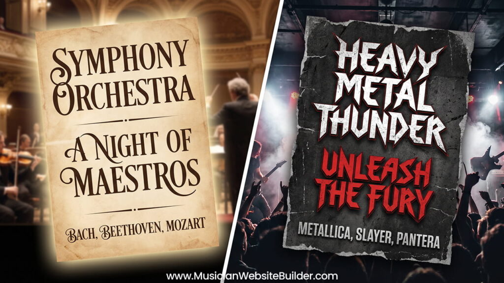
Classical Elegance: Serifs and Sophistication
Classical music needs a refined and timeless look. It connects to history, skill, and tradition. Because of this, Serif fonts work best. These fonts have small lines at the ends of letters. They give a classic and formal feeling.
Serif fonts also improve reading. This matters a lot in printed programs or posters. People often read them in low light, like inside a concert hall. So, clear and elegant fonts help improve the experience.
The Gold Standard: Old Style and Transitional Serifs
Old Style and Transitional Serif fonts match classical music very well. Fonts like Garamond or Baskerville show this style. They have a clear difference between thick and thin lines. This detail reflects old handwriting styles.
These fonts feel traditional. At the same time, they look clean and balanced. Because of this, they help show the history behind classical music. They also make designs look professional and trusted.
Pairing for Programs and Posters
Font pairing for classical designs needs careful planning. A common method is to mix a Serif with a Sans-Serif font. This creates a clean and readable layout.
The main font should be a strong Serif. It shows titles and important names. This gives a sense of importance and control. The second font should be simple and clear. A Humanist Sans-Serif works well for this purpose.
This combination creates space in the design. It helps the reader focus without stress. As a result, the design feels calm and easy to read, even in dim light.
The Raw Power of Metal: Aggression and Texture
Metal music uses a very different style. It focuses more on emotion than readability. The goal is to show power, darkness, and intensity. Because of this, fonts look rough, sharp, and sometimes broken.
These fonts often look like they were carved or scratched. They give a raw and strong feeling. This matches the loud and heavy sound of metal music.
From Blackletter to Distorted Display
Many metal designs use Blackletter fonts. These fonts come from old Gothic writing styles. They feel dark and complex. Because of this, they match the themes of metal music.
Some metal subgenres go even further. Death Metal and Black Metal often use very complex logos. These logos can look messy or hard to read. However, this is part of the style. It shows rebellion and extreme emotion.
Balancing Chaos with Clean Sans-Serifs
Even though metal fonts look chaotic, balance is still needed. The main logo is often very detailed. Because of this, supporting text must stay simple.
A clean Sans-Serif font works best for this role. Fonts like geometric styles provide strong contrast. They help show important details clearly.
This mix creates a strong visual effect. The main font grabs attention. Meanwhile, the supporting font keeps information readable. As a result, the design feels both powerful and organized.
Universal Rules for Successful Pairing
Even though music styles differ, some rules always apply. Good font pairing follows clear design principles. These rules help create strong and professional layouts.
Contrast is Key
Contrast helps designs stand out. Using two very similar fonts often looks like a mistake. For example, pairing two Serif fonts may confuse the viewer.
Instead, mixing styles works better. A decorative font can pair with a simple one. A bold font can match with a light one. This difference creates visual interest and clarity.
Matching x-Heights and Moods
The x-height shows the size of lowercase letters. Fonts with similar x-heights often look better together. This creates balance in the design.
Mood also plays a big role. Fonts must match the feeling of the music. A playful font does not fit a dark metal theme. In the same way, a harsh font does not suit classical music.
Because of this, designers must think about both style and emotion. Matching these elements creates a stronger visual message.
Conclusion: Creating a Cohesive Visual Identity
Font pairing helps build a clear identity. It connects music with visuals in a strong way. Whether the design is for classical or metal, the fonts must match the sound.
Good typography acts like a bridge. It links the artist and the audience before the music starts. Because of this, careful font selection matters a lot.
Understanding style, history, and structure helps improve design choices. When done right, typography does more than look good. It helps people feel the music through visuals alone.