For a debut music artist, the first online impression matters a lot. Social media platforms decide who sees content. However, an official website gives full control to the artist. That is why a website still matters, even in the age of TikTok and Instagram.
At the beginning of a music career, a large website is usually unnecessary. Most new artists only have a few songs, some photos, a short biography, and maybe a launch event. Because of that, a single-page website works much better.
A single-page music website keeps everything simple. Visitors do not need to open many pages. Instead, they scroll through one clean layout that tells the artist’s story from top to bottom.
This guide explains how to plan, design, and improve a strong single-page website for a debut music release.
Why a Single-Page Website Works Well for New Artists
New artists often have limited content during the early stages of their career. Building many pages can make the website feel empty. On the other hand, a one-page layout keeps the experience focused and clean.
Single-page websites also reduce distractions. Visitors stay on one page instead of jumping between sections. As a result, people are more likely to stream music, follow social accounts, or join a mailing list.
Higher Conversion Rates
A focused layout helps users take action faster. Since there are fewer links and fewer distractions, visitors can quickly find the music or signup form.
For example, a listener who arrives from Instagram can instantly press “Listen on Spotify” without searching around the site.
Better Mobile Experience
Most music fans visit websites from mobile devices. Usually, they come from TikTok, Instagram, YouTube, or X links. Scrolling through one page feels natural on smartphones.
Because of this, single-page websites often perform better on mobile than traditional multi-page designs.
Lower Costs and Easier Updates
A one-page website costs less to build and maintain. This matters for independent artists working with smaller budgets.
Updating the website also becomes easier. New music, tour dates, or photos can be added quickly without redesigning several pages.
The Structure of a High-Impact Music Landing Page
A strong music landing page should guide visitors smoothly from one section to the next. Good structure keeps users interested and helps them understand the artist’s identity.
The following five sections create a strong foundation for a debut artist website.
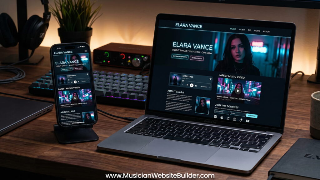
1. The Hero Section
The hero section is the first thing visitors see before scrolling. Therefore, it must create a strong first impression immediately.
Visual Design
Use a high-quality promotional image that matches the mood of the music. Some artists also use short background video loops. However, the visuals should stay clean and optimized for fast loading.
The website design should match the sound of the music. Dark electronic music should not use bright pastel visuals. Likewise, soft acoustic music should not look aggressive or chaotic.
Headline
The headline should clearly introduce the artist and latest release.
Examples include:
- “The Debut Single ‘Echoes’ Out Now”
- “New EP Streaming Everywhere”
- “Official Website of [Artist Name]”
The message should stay short and direct.
Main Call-to-Action
Every hero section needs one clear action button. This button should direct visitors toward the most important goal.
Common examples include:
- Listen on Spotify
- Watch the Video
- Pre-Save the EP
- Stream Now
The button should stand out from the rest of the design using a strong accent color.
2. Music and Video Streaming Section
Fans visit music websites mainly to hear music. Because of that, streaming access should feel simple and immediate.
Audio Players and Smartlinks
Spotify embeds and Apple Music widgets help visitors play music directly from the page. This keeps users engaged without forcing them to leave the site.
Responsive embeds also improve mobile usability. The player should resize properly across different screen sizes.
Video Integration
Music videos add personality and visual identity to the release. Embedding a YouTube or Vevo player allows fans to watch content directly on the page.
Still, videos can slow down website performance. To avoid this issue, lazy-loading should be used. This method loads the video only after users scroll to that section.
As a result, the website loads faster on both desktop and mobile devices.
3. Artist Biography and Press Assets
The biography section introduces the story behind the music. It helps fans and industry professionals understand the artist’s direction and identity.
Writing the Biography
The biography should stay concise. Around 150 to 250 words is enough for a debut artist.
The content should focus on:
- Music genre
- Main influences
- Creative style
- Message behind the project
Long biographies often lose attention quickly. Therefore, clear and simple writing works better.
Hidden EPK Strategy
Many artists create separate Electronic Press Kits. However, a simpler method can work just as well.
A small “Press & Media Assets” button can link to a private Google Drive or Dropbox folder. This folder may include:
- High-resolution press photos
- WAV audio files
- Full biography
- Stage plots
- Promotional materials
This approach keeps the website clean while still helping booking agents and media contacts access important files.
4. Mailing List Signup Section
Social media platforms change constantly. Algorithms can reduce reach without warning. However, an email list always belongs to the artist.
Because of that, mailing lists remain one of the most valuable tools for fan growth.
Placement Matters
The signup form should appear around two-thirds down the page. At this point, visitors already understand the artist and may feel more interested in joining.
Offer a Simple Incentive
Fans usually need a reason to subscribe. Small rewards can improve signup rates significantly.
Examples include:
- Unreleased demo tracks
- Early merchandise access
- Behind-the-scenes content
- Exclusive updates
The reward does not need to feel complicated. Simple exclusives often work best.
Keep the Form Short
Long forms reduce conversions. Therefore, only ask for essential information.
A first name and email address are usually enough.
5. Social Links and Footer
The final section should include social media links and copyright information.
Platforms often include:
- TikTok
- YouTube
- X
Each link should open in a new browser tab. This keeps visitors connected to the website while exploring social content.
The footer design should remain clean and minimal.
Building a Strong Visual Identity
A music website should feel connected to the artist’s sound and personality. Consistency across visuals helps people remember the brand more easily.
Before choosing templates or building layouts, a clear visual style should be planned first.
Typography
Using too many fonts creates confusion. Two fonts are usually enough.
A stylized font can work for headings and logos. Meanwhile, a clean sans-serif font improves readability for body text.
Color Palette
A simple color palette creates stronger visual consistency.
Most music websites only need:
- One main background color
- One text color
- One accent color for buttons
- One supporting color if necessary
CTA buttons should always use the accent color. This helps important actions stand out clearly.
Mobile-First Website Design
More than 80% of music fans browse websites on smartphones. Because of this, mobile optimization should always come first.
Text should stay large enough to read comfortably on small screens. Buttons should also remain easy to tap.
Touch targets should be at least:
48×48
This reduces accidental clicks and improves usability.
Constant mobile testing is important throughout the design process.
Choosing the Right Website Builder
Custom-coded websites can cost a lot of money. For debut artists, that investment usually makes less sense early on.
Modern website builders already provide excellent templates and music-focused tools.
Carrd
Carrd works well for artists on strict budgets. It loads quickly and handles single-page websites very efficiently.
However, advanced features remain limited.
Squarespace
Squarespace focuses heavily on visual presentation. It offers polished templates and strong audio integrations.
Still, monthly pricing can feel higher for independent artists.
Bandzoogle
Bandzoogle was created specifically for musicians. It includes tools for merch sales and fan management.
However, some artists may feel the interface looks less modern than newer design platforms.
WordPress with Elementor
WordPress combined with Elementor offers complete design freedom. It also supports strong SEO features and plugin flexibility.
At the same time, it requires more technical management, including hosting and security updates.
Technical Optimization and Common Mistakes
Even a beautiful website can fail if it loads slowly. Technical performance matters just as much as visual design.
Optimize Images
Large image files often damage website speed. High-resolution press photos should always be compressed before upload.
Modern formats like .webp improve performance while maintaining visual quality.
Use Smooth Scrolling
Since all content appears on one page, navigation links should use anchor scrolling.
For example, clicking “Bio” should smoothly scroll down the page instead of refreshing it.
This creates a smoother user experience.
Buy a Custom Domain
Free subdomains often appear less professional. A clean domain name builds stronger trust with fans, labels, and booking agents.
Using a professional domain also improves branding consistency across social platforms.
Final Thoughts
A strong single-page music website gives debut artists a focused digital home. Instead of overwhelming visitors with unnecessary pages, it guides them through one clear experience.
Fast loading, strong visuals, easy music access, and simple calls-to-action all help turn casual listeners into loyal fans.
When the design matches the music and the structure stays simple, a one-page website becomes a powerful tool for launching a music career.