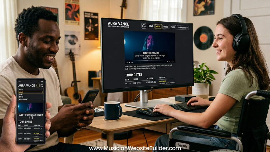
An artist’s website is the main digital space for the fan community. It is where fans stream new songs, buy limited vinyl records, check tour dates, and connect with the culture around the music. However, when a website has design barriers, many fans cannot fully use it.
Web accessibility helps everyone use a website, including people with visual, hearing, motor, or cognitive disabilities. An accessible music website does not weaken a band’s style or identity. Instead, it helps more people enjoy the music and become part of the community.
Why Accessibility Matters for Artists
Expanding the Fanbase Through Inclusion
Around the world, about 1.3 billion people live with some type of disability. Many of these people listen to music every day, attend concerts, stream tracks online, and buy merchandise. Therefore, accessibility is not a small issue for the music industry.
When a website blocks a screen reader user from opening a tour page, or prevents a fan with motor disabilities from clicking a ticket button, the artist loses an important connection. In many cases, that also means losing sales and long-term supporters.
An accessible website helps every fan feel welcome. As a result, artists can build stronger communities and reach more listeners.
Legal Requirements and WCAG Standards
Accessibility is not only about fairness. It is also connected to legal standards in many countries. The Web Content Accessibility Guidelines (WCAG) are the main international standards for accessible web design.
Both independent artists and large music companies have faced legal complaints because their websites were difficult for disabled users to access. Laws such as the Americans with Disabilities Act (ADA) continue to increase pressure on digital platforms to improve accessibility.
Following accessibility standards protects the future of the website while making sure all fans can use it properly.
Main Parts of an Accessible Music Website
1. Audio and Video Should Not Depend Only on Sound
Music websites naturally focus on audio content. Still, websites should not depend only on sound because deaf and hard-of-hearing fans also need equal access.
Add Text Transcripts
Podcasts, interviews, spoken introductions, and video conversations should include text transcripts nearby. This allows users to read the content if they cannot hear it clearly.
Use Captions for Videos
Music videos, behind-the-scenes clips, and studio updates should always include synchronized captions. Captions help users understand lyrics, speech, and important sounds.
Avoid Auto-Playing Audio
Many music websites automatically play songs when the homepage opens. While this may seem exciting, it creates serious accessibility problems.
Auto-playing audio interrupts screen readers and makes navigation difficult for visually impaired users. In some situations, users cannot quickly find the pause or mute button.
Instead, visitors should always control playback themselves through a clearly labeled play button.
2. Navigation Must Work Without a Mouse
Some users cannot use a mouse or trackpad because of motor disabilities. They often navigate websites with keyboards, switch devices, or mouth sticks. Because of this, websites must fully support keyboard navigation.
Keep a Logical Focus Order
When users press the Tab key, the focus should move through the page in a clear and organized order. The movement should match the visual layout from top to bottom.
If the focus jumps randomly around the page, navigation becomes confusing.
Use Visible Focus Indicators
When a user tabs to a menu link, social media icon, or audio control, a visible outline should appear around that item.
Some designers remove the browser’s default focus outline to make the design cleaner. However, removing it without adding another visible indicator creates major accessibility problems.
Without a visible focus state, keyboard users may not know where they are on the page.
3. Visual Design Must Balance Style and Readability
Many underground or alternative music websites use dark colors and low-contrast designs. For example, designers may place dark gray text on black backgrounds to create a moody appearance.
Although this style may look artistic, it can become difficult to read for people with low vision or color blindness.
Maintain Proper Color Contrast
To meet WCAG AA standards, text should have a contrast ratio of at least 4.5:1 against its background. Large text should have a minimum ratio of 3:1.
Strong contrast improves readability for everyone, not only disabled users.
Do Not Use Color Alone
Important information should never depend only on color.
For example, a sold-out concert date should not only change from green to red text. Some users with color blindness may not notice the difference.
Instead, websites should include clear labels such as “[SOLD OUT]” next to the date.
Improving Artist Media Pages Step by Step
Making Tour and Gig Calendars Accessible
Tour calendars often create accessibility problems. Many ticket widgets use outside frameworks that do not work correctly with screen readers or keyboard controls.
Use Semantic HTML Tables
Tour dates should use proper HTML table structures such as <table>, <tr>, <td>, and <th>.
These structures help assistive technologies understand rows, columns, dates, and locations correctly.
Write Clear Button Labels
Many tour pages use several buttons that only say “Tickets.” For screen reader users, this creates confusion because every button sounds the same.
Instead, buttons should include descriptive accessibility labels.
Example:
<button aria-label="Buy tickets for London show on October 12th">Tickets</button>This gives users enough context to understand which event the button belongs to.
Making the Merchandise Store Easy to Use
The online store is one of the most important parts of an artist’s website because merchandise sales directly support the artist.
Add Clear Form Labels
Drop-down menus for shirt sizes, vinyl versions, or color choices should always include visible labels.
Placeholder text inside fields is not enough because it often disappears once users begin typing. This can confuse people with memory or cognitive difficulties.
Create Better Checkout Error Messages
Checkout forms should clearly explain problems.
Instead of only turning a form border red, the website should display a direct message such as:
“The postal code entered is missing a digit.”
Clear instructions help users complete purchases without frustration.
Writing Better Alt Text for Images
Search engines cannot understand images directly, and visually impaired users cannot see them. Alt text solves this problem by describing the image content.
Good alt text should explain the important details in simple language.
| Image Type | Poor Alt Text | Better Accessible Alt Text |
|---|---|---|
| Album Cover Art | cover.jpg | Album art for the record Echoes in Dust, showing a black-and-white sketch of an acoustic guitar surrounded by desert plants. |
| Promotional Band Photo | band_photo_3 | Promotional photo of four band members standing near a brick wall at dusk while wearing matching denim jackets. |
Descriptive alt text improves accessibility and also helps search engines understand the content better.
Testing the Website for Accessibility
Accessibility is not a one-time task. Websites need regular testing and improvements.
Use Automated Accessibility Scanners
Tools such as Google Lighthouse and WAVE can quickly detect common problems. These tools often identify missing alt text, weak color contrast, and broken heading structures.
Test the Website With Only a Keyboard
A simple but effective test is to disconnect the mouse and browse the entire website using only the keyboard.
Users should be able to navigate menus, play music, and add products to the shopping cart using only the Tab, Shift + Tab, and Enter keys.
Try a Screen Reader Walkthrough
Built-in screen readers such as VoiceOver on Apple devices or Narrator on Windows help developers hear how the website sounds to visually impaired users.
If menus sound confusing or important controls are skipped, the website needs adjustments.
Conclusion
Accessibility does not limit creativity or damage a music website’s identity. Instead, it helps more people connect with the artist and the community around the music.
Clear navigation, readable design, proper coding structure, captions, transcripts, and descriptive text all make the website easier to use for everyone. As a result, fans can enjoy music, buy merchandise, and follow tours without barriers.
When a music website welcomes all users, the relationship between the artist and the audience becomes stronger, and the entire community benefits together.